

31.3.15
covers
I'm happy to have one of my favourite pieces, made during the SIM residency, on the cover of Nils Frahm's new solo piano album. Here are the front + back covers, with Nils' evocative track titles. The album package/graphic designer, Torsten Posselt, studio FELD did a beautiful job integrating the artwork and all of the album components.
Nils timed the album release with his new world-wide holiday, Piano Day, and the vinyl and cd sales will go towards a fundraiser to build the Klavins M450, the world's tallest piano. Nils' 8 compositions were performed and recorded on a prototype of the piano. You can read all about the project on the Piano Day site. The album is also available as a free download from the Piano Day site. Nils Frahm "solo" is a beautiful set of compositions. Available on Erased Tapes. Enjoy!
You can keep up with Nils here.
And, we look forward to hearing him on the west coast again — check for concert listings near you!
4.11.13
away
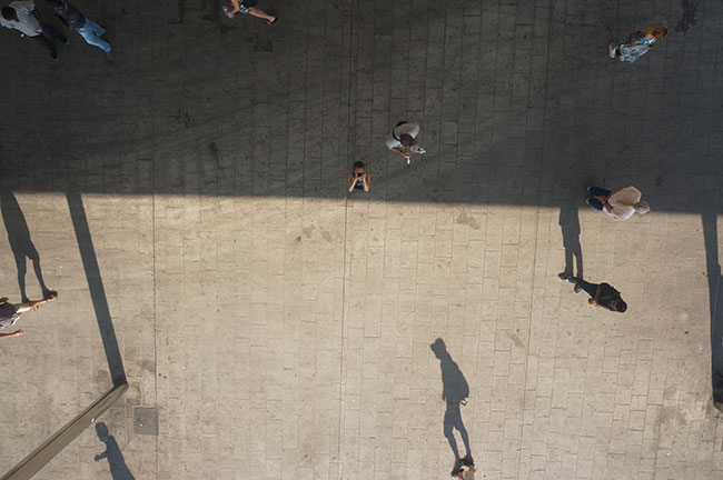
This past June, I participated in a month-long residency in Reykjavik Iceland, then spent a few weeks travelling south, then back home, travelling between BC and Saskatchewan. In the next few weeks, I'll update these pages with some of the work I completed at the residency. In the meantime, I chose this image from Marseille as one of my favourite photographs from my time away. The Vieux-Port in Marseille has been graced with a brilliant, reflective canopy and I really enjoyed tipping my camera sky-ward and waiting for just the right shadows to step into view. The experience was a bit like watching an abstract composition in constant and magical movement. I'm in this photograph too, the little inverted 'V' in the middle of the image.
After my return to Vancouver, I completed this oil monotype titled Traveller's Window. This piece is on exhibition in Split, Croatia for the Splitgraphic Biennial VI. The background is a bi-colour impression from a block of wood that's been lightly distressed and curiously textured by time, growth and insects. The panoramic format and the irregularly shaped bars of colour hugging the edges remind me of the glimpses one gets while travelling through.
4.12.12

23.10.12
monotypes
My newest monotype is titled "Traveller's Window IV. The deep midnight / aubergine background was printed from two blocks of wood, one inked in black, the other in magenta; the two colour layers creating a deeper sense of space. The flickering light elements in the background are the grain of the wood block and some tiny marks etched into the wood block by insects. I overlaid the space with forms printed in pale yellow, aqua, mid-green, orange and rose. And yes, there is a Traveller's Window II and III...they're in Toronto, on display at the Toronto International Art Fair, but if you're in Vancouver, you can stop by for a visit and see "IV" at my studio. And, from January 3 - February 3, 2013, it's installed in a show on safe studio practise "non toxic" printmaking, at Dundarave Print Workshop, 1640 Johnson Street, on Granville Island (Vancouver).
22.10.12

toronto international art fair
The Toronto International Art Fair opens October 26 - 29, 2012. I have monotypes on exhibit at the Open Studio Printmaking Centre booth...feel free to drop by if you're in Toronto.
21.10.12
autumn 2012
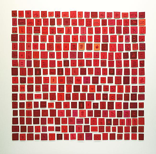
I just installed this piece at Chocolate Arts, one of my studio neighbours. It is made of many, many paint films, mounted on irregular squares and rectangles, a variety of reddish shades. Each little square and rectangle (most are approximately 1 x 1.5 inches) is mounted at a different level, so they sort of hover, cast shadows, and seem to be an animated collection. I think there are about 300 pieces, and the overall size is
40 x 41 inches. This red version is similar to this piece.
13.6.12
new
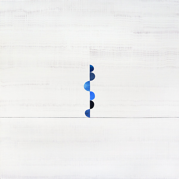
I just finished this painting. I decided to call it "ripple" because of the softly animated linear marks that seem like waves, shifting the space from left to right. It's a subtle shift, amplified a little by the indigo and cobalt blue, balancing forms. And, like all subtle, white paintings, this one is difficult to capture with a camera.
It's light, many-layered, and once again, I'll use the word subtle.
I paired this painting as the "companion" to this photograph, which is my "spark of the month" for June...
I paired this painting as the "companion" to this photograph, which is my "spark of the month" for June...
a double ode to our early summer rainy/grey month.
28.10.11
The Toronto International Art Fair
This is the weekend for the Toronto International Art Fair.
Open Studio is an exhibitor this year and their booth includes six of my large monotypes and works by
Barbara Balfour, Nadine Bariteau, Yael Brotman, Sean Caulfield, Susan Collett, Tara Cooper, Joscelyn Gardner, Libby Hague, Brian Hoxha, Brian Kelley, Judith Klugerman, Jenn Law, Jennifer Linton,
Wendy Morosoff Smith, Ann McCall, Suzanne Nacha, Sandi Ralph, Tammy Ratcliff, Bernice Sorge,
Penelope Stewart, Jeannie Thib, and Celeste Toogood.
journal artwork
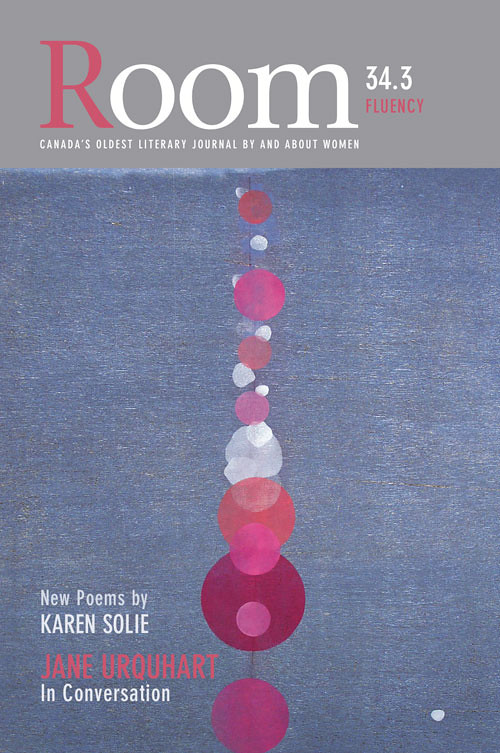
The Fluency Issue of Room Magazine arrived in the mail today.
Paula Grasdal designed the front cover for the Autumn edition, V. 34.3. She chose one of my monotypes, Her Thought Bubble,
from a series of large-scale monotypes that I finished in 2005. This
piece was printed on mulberry paper and chine colléed onto a larger
sheet of BFK Rives. It's in the collection of the Canada Council Art
Bank. I thought Paula did a lovely job of this cover; it's not always
easy to integrate artwork.
Here's a full view of Her Thought Bubble.
Here's a full view of Her Thought Bubble.
7.9.11
a week of spark
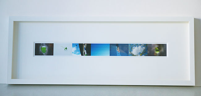
I just finished framing a week of Spark. It's shadow-boxed, with a thick 8-ply window mat.

Here's another view of the set of photographs | image size: 21" x 2" | frame size: 29" x 10"
And here are the links to view the original Spark posts :
18.8.11
new in the studio
Some quick snapshots of new paintings that I've been mulling over this spring and summer.
The working title for this one is Open. It's 20 x 24 inches, about a dozen layers of fine blue and grey glazes over the stack of colours and a blur of the colour stack, shifting to the right. The background is a softly textured white, with another texture for the "horizon" area.
This one is titled Sound II. It's 24 x 24 inches, acrylic on wood panel. I'm still planning a few more light layers. There are about 40 layers to this point. Small white squares float in the background and there's a subtle blur on the "horizon."
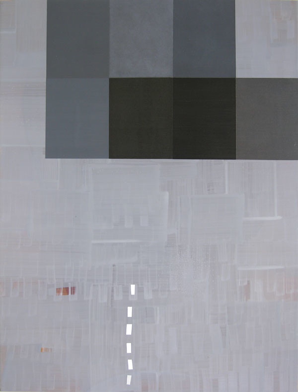
Cairo | 18.5 x 24 inches | acrylic on wood panel
Deep glaze layers, and a variety of different, subtle textures in each of the "grey" blocks. The grey block on the right is actually a view through to the background.
The working title for this one is Open. It's 20 x 24 inches, about a dozen layers of fine blue and grey glazes over the stack of colours and a blur of the colour stack, shifting to the right. The background is a softly textured white, with another texture for the "horizon" area.
This one is titled Sound II. It's 24 x 24 inches, acrylic on wood panel. I'm still planning a few more light layers. There are about 40 layers to this point. Small white squares float in the background and there's a subtle blur on the "horizon."
Cairo | 18.5 x 24 inches | acrylic on wood panel
Deep glaze layers, and a variety of different, subtle textures in each of the "grey" blocks. The grey block on the right is actually a view through to the background.
Bits of plum-coloured underpainting open up from the bottom glaze layers.
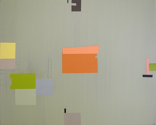
Sender | 16 x 20 | acrylic on wood panel
I was thinking of a palimsest of marks and shapes with this painting. It is a soft, sage green, with a hint of texture from well below the glazes...a semi-circular form underneath on the right hand side and oblong ovoids on the left, resting beneath the colour blocks.
Threefold | 12 x 12 inches | acrylic on wood panel
An overall sense of texture in the blue/grey background. Balancing bar of cerulean blue on the left hand edge. Crackle forms under the colour blocks.
11.6.11

art auction for UNICEF
Unite With Art is the 4th Annual Fine Art Auction/Gala Fundraiser to benefit UNICEF Canada.
It's taking place this coming Saturday, June 18 at the Rocky Mountaineer Station.
For tickets and further information, visit the Unite With Art website.
The Auction includes In the Spring of the Year, a painting I completed in 2009.
30.4.11
silent auction
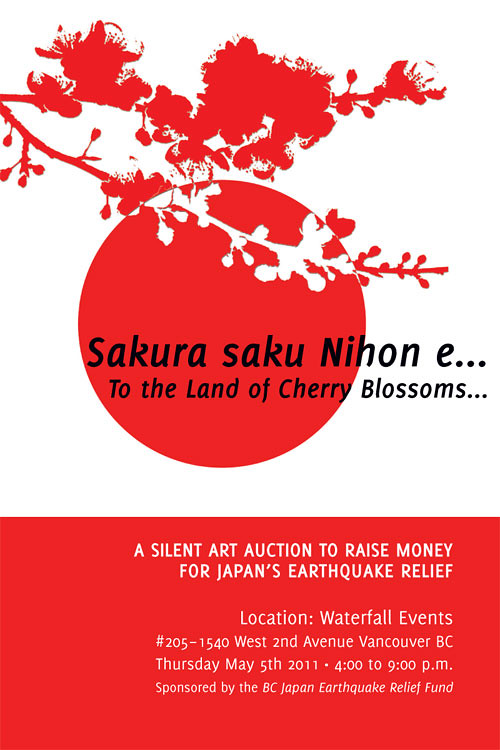
Sakura Saku Nihon e | To the Land of Cherry Blossoms
There's an upcoming Fine Art Auction to benefit earthquake relief in Japan, sponsored by BC Japan Earthquake Relief Fund. It's being held at the Waterfall Events location, in the Waterfall Building at 205 - 2540 West 2nd Avenue, Thursday, May 5, 2011, 4 - 9 pm. Tickets are $10.
The Auction includes work by Malcolm Aiken, Mariko Ando Spencer, Nelly Cesar, Lucie Chan,
Adela Chau, Dana Claxton, Christine D’Onofrio, Antonio E. Fernandez, Yoriko Gillard, Paula Grasdal,
Gu Xiong, Martin Guderna, Kelly Haydon, Robert Held, Annie Hong, Ooya Houen, Tomoyo Ihaya,
Eri Ishii, Joy Kim, Earl Mabaquiao, Donald MacDougall, Ilsoo Kyung MacLaurin, Brenda Mattman,
Kozue Matsumoto, Phil McCrum, Shinsuke Minegishi, my name is scot. Manuel Pina, Marina Roy, Yumiko Sasakawa, Sarah Savoy, Jasha Sokolovic, Nicole Steinbre, Ban Wei, Janice Wong and Yoshi Yamamoto.
The piece that I've donated for the auction is this monotype titled Tree Tops.
19.4.11
a reblog from Spark...
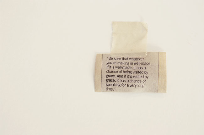
This quote from Bill Reid has been taped to the inside of one of my old studio cabinets for quite some time. The cabinet found its way into our garage three years ago and I'd almost forgotten about this tiny slip of paper. Seeing it again made me smile...it surely is a Spark.
And, yesterday was Spark's first birthday. I'll put together a few thoughts about that in the days to come.
18.3.11
spark | a book
April 17th marks Spark's first year in a blog format. A few months into the venture, I thought it would be fun to present a year of Spark in book form. So, I'll be spending the next several weeks assembling the collection, a task I'll wedge in between the paintings I'm currently working on in the studio.
22.1.11

art is long, life is short
I thought I would re-blog today's Spark. It's a fortune cookie aphorism, rendered in silver—a New Year's gift from Donna Leisen, my studio neighbour and one of the many talents at Aurelia.
- Ars longa,
- vita brevis,
- occasio praeceps,
- experimentum periculosum,
- iudicium difficile. — Hippocrates
- Ὁ βίος βραχύς,
- ἡ δὲ τέχνη μακρή,
- ὁ δὲ καιρὸς ὀξύς,
- ἡ δὲ πεῖρα σφαλερή,
- ἡ δὲ κρίσις χαλεπή.
- It's interesting to read "This is one of those rare phrases in which the meaning is more debated than the origin. What is usually understood...is something along the lines of 'art lasts forever but artists die and are forgotten.'
- ...a misunderstanding based on the translation of the word 'ars' as 'art.' If we accept that the Latin term 'ars' is equivalent to the Greek 'techne' (τέχνη): technique, skill, and that, consequently, 'ars' is better translated into English as 'skill' or 'craft,'...that would lead us to interpret the meaning as 'it takes a long time to acquire and perfect one's expertise and one has but a short time in which to do it.'" and I prefer this idea of craft, preparation, training; the years in the making (of an artist and their work).
4.1.11

sparks fly
The mini Sparks finally went out in the mail today, one for every kind soul who emailed to tell me about their Favourite Spark.
8.11.10

Orbit
I titled this photograph Orbit on my spark post today; an image and title that anticipates the week ahead....I'll be orbiting a few deadlines.
5.11.10

The Armoury District
I'm still referring to my studio as "my new studio." After 17 years in the old studio at 1000 Parker Street, 2 years at 1707 Fir Street still feels very new. I like everything about my new neighbourhood. There are some delicious food purveyors, a guerilla gardening project across the street on the old Arbutus rail line, and, with the proximity to the water, the air always feels so fresh. I'm also a hop-skip away from Granville Island, home to my "second studio," Dundarave Print Workshop, and
Kroma Paints, Opus. Even my frame supplier is just halfway down the alley. Since the spring, my neighbourhood has been evolving. A variety of new businesses, many related to art and design, have started sprouting up north of fourth avenue, between Granville and Burrard. There's even a new blog to announce The Armoury District (named after the Seaforth Armoury on Burrard and 1st.)
Ah, looks like I'd better wash my studio window...
4.11.10

Night Falls | oil monotype | 24 x 24 in | paper size: 40 x 40 in
If You're in Toronto...
Open Studio Printmaking Centre | Print Sales Program | Toronto ON
Open Studio in Toronto has added a few of my large monotypes to their Print Sales Program.
Open Studio is Toronto's primary printmaking studio, located in the 401 Richmond building,
a heritage location which houses the printmaking studio and gallery, along with a micro village
of cultural enterprises. 401 Richmond and the intent of its owners is inspiring.
Here's an excerpt from their website:
401 Richmond is a historic warehouse in downtown Toronto and home to over 140 cultural producers and microenterprises. Aware of the need for affordable workspace in the city’s downtown core, the Zeidler Family who purchased the property in 1994, took an aged building with 40% occupancy, and rather than tarting it up or tearing it down, transformed it into a fully-leased thriving cultural and commercial centre within 18 months. Today the building has an eclectic tenant base that reflects the variety of artistic practices and entrepreneurial endeavours taking place in Toronto's cultural centre. Browsing through the Tenant Directory will give you a pretty good idea of the kinds of things that take place under this roof every day. 401 Richmond is home to 12 art galleries, fashion designers, film makers, jewelers, architects, animators, healers, communications specialists, graphic artists, milliners, charitable organizations and even a Spanish dance school.
2.11.10

Poppy Copper Dot Heart
This is one of my favourite, recent images from the Spark Project. In many ways, it shares many attributes with my recent paintings. It's titled Poppy Copper Dot Heart. And, just as an aside,
Dot Heart is a translation of Dim Sum. In its finest form, Dim Sum is a repast filled with little morsels meant to delight the heart. And, it's November, the month that brings Remembrance Day, the first
of our winter rains, fiery leaves and...poppies for souls past and present.
ps. these bright circles of pink paint are the work of civic surveying crews, laid down as markers for the construction and reconstruction of our city streets. I'm not sure why they always have a copper disk nailed in the centre.
5.8.10

Vancouver Province Newspaper Article
Thursdays Vancouver Province article didn't have room for the long version of some of
the answers, so I thought I'd put the outtakes here: The outtakes are the green coloured text:
Vancouver Province Newspaper (Vancouver BC) interview:
Portraits of an Artist: Pencil in a visit to Art Beatus and its special works
Hans Ongsansoy, Thursday, August 5, 2010
This week's Portraits of an Artist is a special one because we get to feature work at one of our favourite galleries in the city: Art Beatus. A small gallery with a focus on contemporary Asian works, Art Beatus feels like a secret you can share with your closest friends This is, in part, due to its unconventional location, inside the downtown office building located at 808 Nelson Street. But, once you find the gallery tucked away in Suite 108, the secret will definitely be out.
The gallery's current show is Line Up!, a four-artist group exhibition with a special focus on drawing. Pieces range from pencil crayon drawings and vinyl (intaglio) prints to pencil sketches and sumi ink drawings.
The latter are the specialty of Janice Wong, who uses sumi ink to create pieces that are playful yet meditative. They also bear a resemblance to the symbols used in music theory, which Wong is happy to discuss in our now-weekly Q & A. Enjoy.
23.7.10

Some Things Take Time
I've been meaning to make a proper scan of the George Bowering book cover. The upcoming exhibition at Art Beatus prompted me to cross this off of my TO DO list. The cover image is from a series of ink drawings, and a few of these are up in the Art Beatus exhibition. This one is called "Tone."
10.7.10

Drawing Show at Art Beatus
Art Beatus is hosting a drawing exhibition in conjunction with the 2nd annual Vancouver Drawn Festival. This year's group exhibition presents new works by four stylistically and thematically diverse contemporary Asian artists. Pieces range from pencil crayon drawings to vinyl intaglio prints, pencil sketches and sumi-ink drawings. The sumi-ink drawings are from a series related to my experience of music. The exhibition runs from July 16 – September 10, 2010.
3.6.10


27.5.10

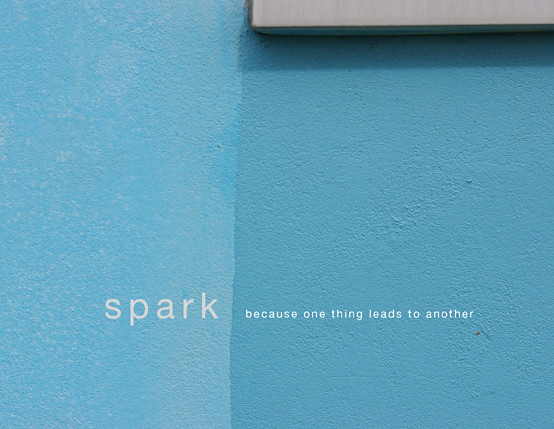
Project
I'm working on a visual blog project: Spark.
Spark has been named blog of the week on the Tyee for the week of May 3, 2010.
When I'm not painting or printing, I take photographs. Spark started in 2008, as a page on a test update for my studio website. Earlier this year, I reconfigured it as a blog. I'm enjoying the practice of simply looking and paying attention. It seems like a way of slowing down time, marking each day before they blur, one into another. My last photo project was a month of skies and each of those mornings remains clear in my memory. I hope the images on Spark also lend a bit of insight into my paintings, drawings and prints.
26.3.10

Vancouver Sun Article
Lucy Hyslop interviewed Shelley Penner about her design studio and included a nod to my recent paintings, accompanied by this photograph by Martin Tessler.
Vancouver Sun | At Home 26/03/2010, Page E2.
24.2.10

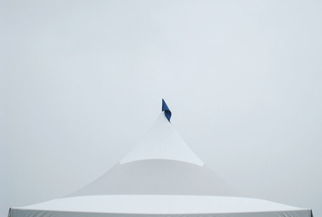
Chinatown
A view of the umbrella canopy installation by ASIR Studio in conjunction with Bright Light temporary public art projects, Yue Shan Courtyard, 39 East Pender, Vancouver Chinatown. I enjoyed this graceful structure. It appealed to me for so many reasons. It was poetic, ephemeral, lyrical, surprising and mysterious; thoughtful, playful, delightful and generous. With its intriguing qualities of repetition and rhythm, it was sensitive to both the time of year (our rainy season) and to its site, floating atop an historic courtyard in Chinatown.
update: the installation was dismantled at the end of February and the individual umbrellas can be found in a few Chinatown stores.
11.10.09
20.7.09


Summer Show | July 2009
Mid-summer is my favourite time of year. Thanks to everyone who helped celebrate the opening of my summer exhibition. It was lovely to finally make use of the courtyard and it gave me great pleasure to share my recent paintings. Special thanks to Paul Fremes (Stuff 2 Do) for the photos and to Geneve Ottman for keeping the sangria topped and chilled.
6.7.09
Flying Books + Dear Neighbours
My hometown show, "Notion", opened on April 17, 2009, at the Art Gallery of Prince Albert
the 4-year-old public art gallery that was built as a complement to the Rawlinson Centre for the Performing Arts. It's a nice, lofty space, 1800 square feet, with a ceiling height that spans a range
of 16 to 30 feet at centre. I enjoyed planning the layout of the work; 7 large paintings, 9 large monotypes and an installation of books.
I'd imagined the flying books as a metaphor for both homecoming and migration. The books,
(all authors, titles and subjects based in Saskatchewan) straddle small rooftops. The rooftops have varying pitch and I'd hoped that, seen front-on, they might resemble birds in flight. On a small floating shelf, above a small stack of books, I installed a tiny model of the house I grew up in.
And one of my favourite photographs from the opening shows our dear former neighbour,
Gertie Tennant, gazing up at the old house.
The house model was built by Garry Lundgren, the rooftops were constructed by Derrick Carter,
the roof angles were calculated by Helen O'Toole and the books were borrowed from the
J.M. Cuelanaere Library in Prince Albert.

And, here are a few more photos from the Notion Exhibition.
My hometown show, "Notion", opened on April 17, 2009, at the Art Gallery of Prince Albert
the 4-year-old public art gallery that was built as a complement to the Rawlinson Centre for the Performing Arts. It's a nice, lofty space, 1800 square feet, with a ceiling height that spans a range
of 16 to 30 feet at centre. I enjoyed planning the layout of the work; 7 large paintings, 9 large monotypes and an installation of books.
I'd imagined the flying books as a metaphor for both homecoming and migration. The books,
(all authors, titles and subjects based in Saskatchewan) straddle small rooftops. The rooftops have varying pitch and I'd hoped that, seen front-on, they might resemble birds in flight. On a small floating shelf, above a small stack of books, I installed a tiny model of the house I grew up in.
And one of my favourite photographs from the opening shows our dear former neighbour,
Gertie Tennant, gazing up at the old house.
The house model was built by Garry Lundgren, the rooftops were constructed by Derrick Carter,
the roof angles were calculated by Helen O'Toole and the books were borrowed from the
J.M. Cuelanaere Library in Prince Albert.
And, here are a few more photos from the Notion Exhibition.
16.3.09


Raw Materials
I was just reading about hoarders. Current thinking seems to point to the idea that hoarders aren't really run-of-the-mill garden variety compulsive obsessives. I'm happy to know this as I'm always finding orphaned, "useful" items to haul to the studio. Supposedly, hoarders think in more complex ways, seeing a myriad of possibilities in items that others might simply see as trash. Most of the artists I know tend to keep all manner of "useful" things. Stuff that might one day find its way into a piece of artwork, or stuff that could be handy for corralling the other accoutrements of studio life. Like shoe boxes and jars. I'm particularly fond of those. Sara—123oleary—recently sent me to a lovely blog by Sharon Mount titled Tiny Buildings. For the past 30 + years, Sharon and her family have been constructing tiny fantasies crafted from business cards, packaging, card stock and other materials. Sharon has even initiated a Flickr group for folks who are attempting to construct their own tiny buildings. Here are a couple of Sharon's buildings.
My favourite is the stripey one. One person's trash...
15.3.09
Recipes + Stuff
Over the years I've received some interesting recipes for grounds and mediums. I keep meaning to try them, and posting them might spur me on. And maybe someone else can give them a whirl and let me know the results.
Here's the first recipe, one for Paste Papers, passed on to me by Tara Bryan, an artist who lives and works in St. John's Nfld. In addition to painting, Tara creates artist books. She often uses Paste Papers in her books. Here is the recipe, just as Tara wrote it:
Cook up some wheat paste and mix it with a bit of acrylic paint. I use yogurt cups to mix in. The acrylic binder makes the surface pretty permanent, and you can brush the colour on and scrape it off or just paint it on. It's LOTS of fun, but you need a drying rack or lots of drying space because it's fast and addictive! I cut plastic coffee can lids into quarters, then cut the point off to make a flat surface that can be made into different "combs" to scrape paste away. Try it, you'll like it! You can use white drawing paper. In schools I have used 11 x 17 copier paper. As long as the paper will stay together wet, it will work.

view of Tara's book "An Angel Takes My Hand"
Unique (1 of 1) artists book. Paste papers, shipping tags, hand-written text by artist
with quotations by famous artists on tags, 5 3/4" x 5 1/4" x 3/8" closed. 1997
Over the years I've received some interesting recipes for grounds and mediums. I keep meaning to try them, and posting them might spur me on. And maybe someone else can give them a whirl and let me know the results.
Here's the first recipe, one for Paste Papers, passed on to me by Tara Bryan, an artist who lives and works in St. John's Nfld. In addition to painting, Tara creates artist books. She often uses Paste Papers in her books. Here is the recipe, just as Tara wrote it:
Cook up some wheat paste and mix it with a bit of acrylic paint. I use yogurt cups to mix in. The acrylic binder makes the surface pretty permanent, and you can brush the colour on and scrape it off or just paint it on. It's LOTS of fun, but you need a drying rack or lots of drying space because it's fast and addictive! I cut plastic coffee can lids into quarters, then cut the point off to make a flat surface that can be made into different "combs" to scrape paste away. Try it, you'll like it! You can use white drawing paper. In schools I have used 11 x 17 copier paper. As long as the paper will stay together wet, it will work.
view of Tara's book "An Angel Takes My Hand"
Unique (1 of 1) artists book. Paste papers, shipping tags, hand-written text by artist
with quotations by famous artists on tags, 5 3/4" x 5 1/4" x 3/8" closed. 1997
15.12.08


Studio Grand Opening | November 2008
After a long summer of studio renovations, I finally returned to painting in October, just in time to finish some work for the grand opening of the new space. We were so happy that the contraptions
we designed for the studio—the moveable wall/storage unit (built by Laurence Heppell) and the sink divider (cobbled together by me and George)—worked, both in terms of aesthetics and function. Everyone who visited seemed to enjoy the space and the various inventions, and the sink divider was deemed worthy of Ikea hacker!
You can click this link to see more photos from the grand opening.
6.10.08

Announcing The Big Move
After a busy summer, moving and renovating, we are finally ready to announce the move.
I took this photograph of the front door, reflecting a bit of the new neighbourhood.
We're just opposite a "guerrilla garden" project that runs along the old Arbutus train line, just around the corner from the sea wall walk to Granville island.
And, here are a few more photos of the space before and after our renovation.
Subscribe to:
Posts (Atom)


